The Library of Congress
"Drawing Justice: the art of courtroom illustration" was a special exhibition by the Library of Congress. For this exhibition, I designed an interactive touchscreen, which allowed visitors to explore these courtroom drawings in greater depth — organized by theme, or organized by artist.
Initial Design
In the initial design phase, when I wasn't certain how many artists would be represented in this interactive, I designed the main menu screens slightly differently.
"Explore by Topic" had a very vertical theme. "Explore by Artist" had a more horizontal theme to it.


Explore the finished design above.
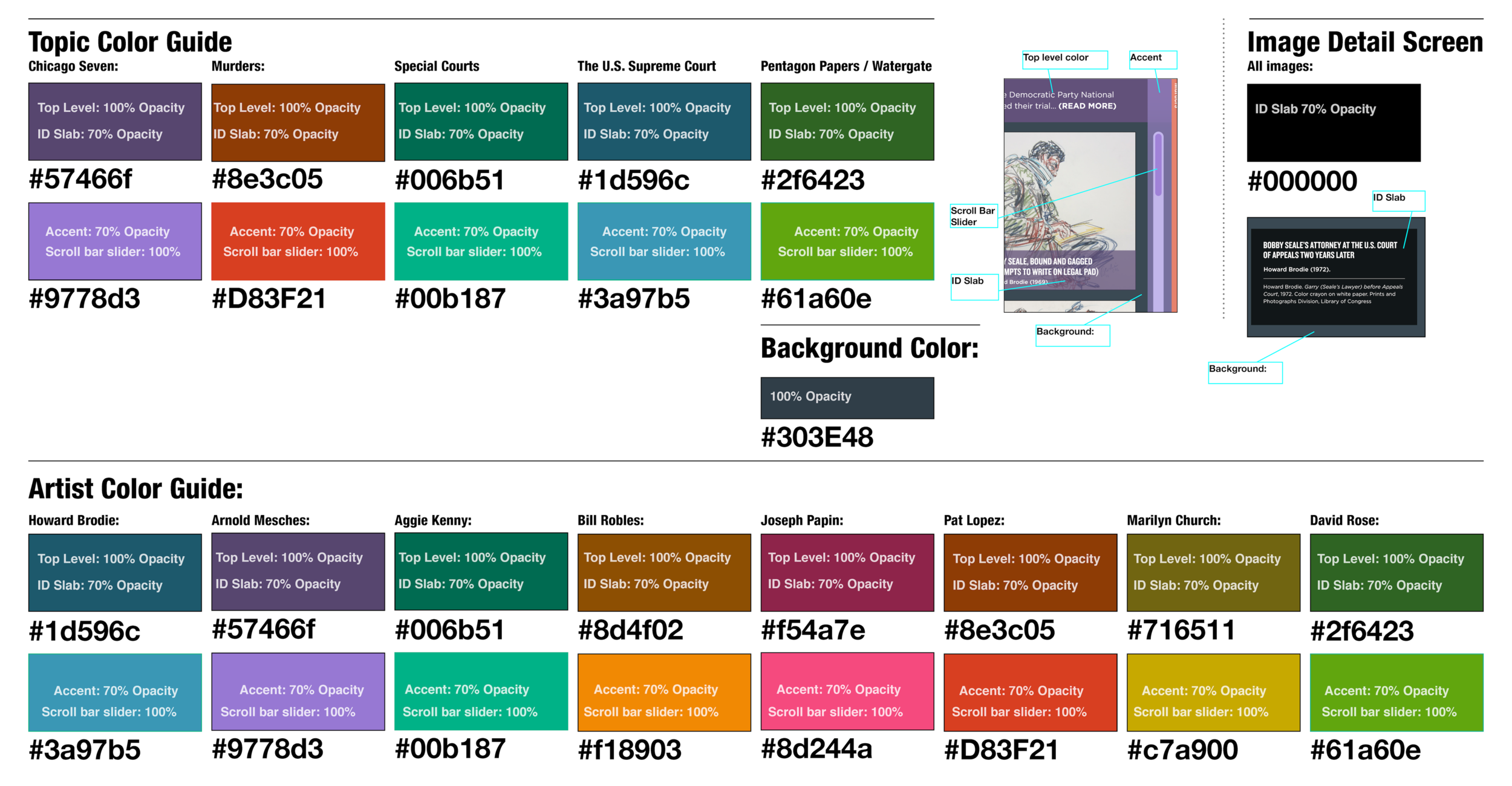


Click through sample pages above from the interactive style guide: pages for color guide, typeface, and sizing.
Prototype Screenflow from Adobe XD
I did most of my designing in Adobe Experience Design (XD), and I recorded this screen flow of the interactions during the design phase. Background colors, interaction animations, scrolling and multitouch capabilities such as pinching and zooming were fine-tuned later.
Transition Animation
I produced this transition animation in Adobe After Effects to show all the stakeholders how I imagined the transition from the main menu to the topic pages would appear.
Drawing Justice Interactive Attract
This was the attract that I designed for the interactive.
Hillmann & Carr website
Hillmann & Carr Inc. is a creative agency based in Washington DC that has been creating media for museums, visitor centers and corporate clients since 1974. I've been working with them since 2011. Recently, they asked me to refresh their website to help them showcase more of their work. The finished product is a truly width-responsive website.

The Hillmann & Carr Website
This is how the Hillmann & Carr website looks now—on both mobile and desktop. However, there was an earlier version that dated to about 2008.
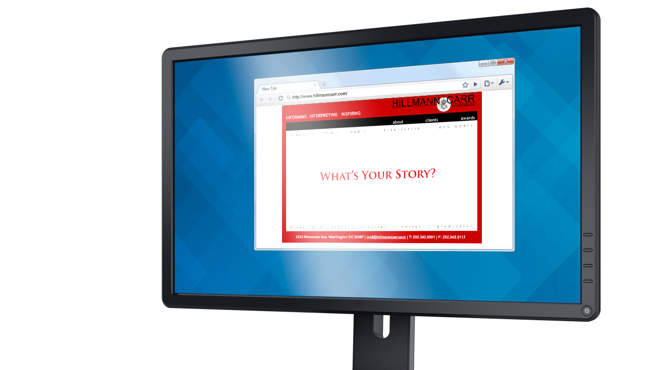
Original Flash Website
Hillmann & Carr’s original website was a simple, flash-based website that was not responsive to mobile devices. Several colleagues agreed that aside from being technologically out of date, the old website was not doing a good job of telling our story as a media production firm.

A Page Tree
As part of a larger précis outlining the goals of the new website, I suggested a page tree of content including pages for: “landing,” “about us,” “what we do,” “case studies,” “clients,” and “contact us.”
Although not all of these survived in the final iteration of the site, it is still pretty close.

The Desktop design of the website
The website is largely a scrolling landing page, with different sections for “process,” “company,” and “contact.” The Gallery is its own separate page.

Responsive Width Website
This sample of the “Gallery” page shows how the design is a responsive width site, so that elements adapt to the device the visitor is viewing on.

The Mobile Site
The mobile site has all of the same content as the desktop site, including the visual ampersand.
Hamburger menu on the mobile site
The menu is available as a hamburger menu.


Scrolling Mobile Site
All the content that is on the desktop site is available on the mobile site.
Game: Washington's Next Move
Client: George Washington's Headquarters at Morristown (a National Park Service site in Morristown, NJ)
Agency: Hillmann & Carr Inc.
Creative Director: Jennifer Gruber
UX Designer: Christopher Richmond
One of the final visitor experiences in the new "Discover History" exhibit at the museum, this interactive puts visitors in the shoes of General George Washington as he breaks camp from his long winter at Morristown. Based on an actual war council that George Washington convened to advise him on his choices in 1780, the aim of this interactive is to teach visitors about the real choices Washington faced, and then show them what he ended up doing to wind down the American Revolution.
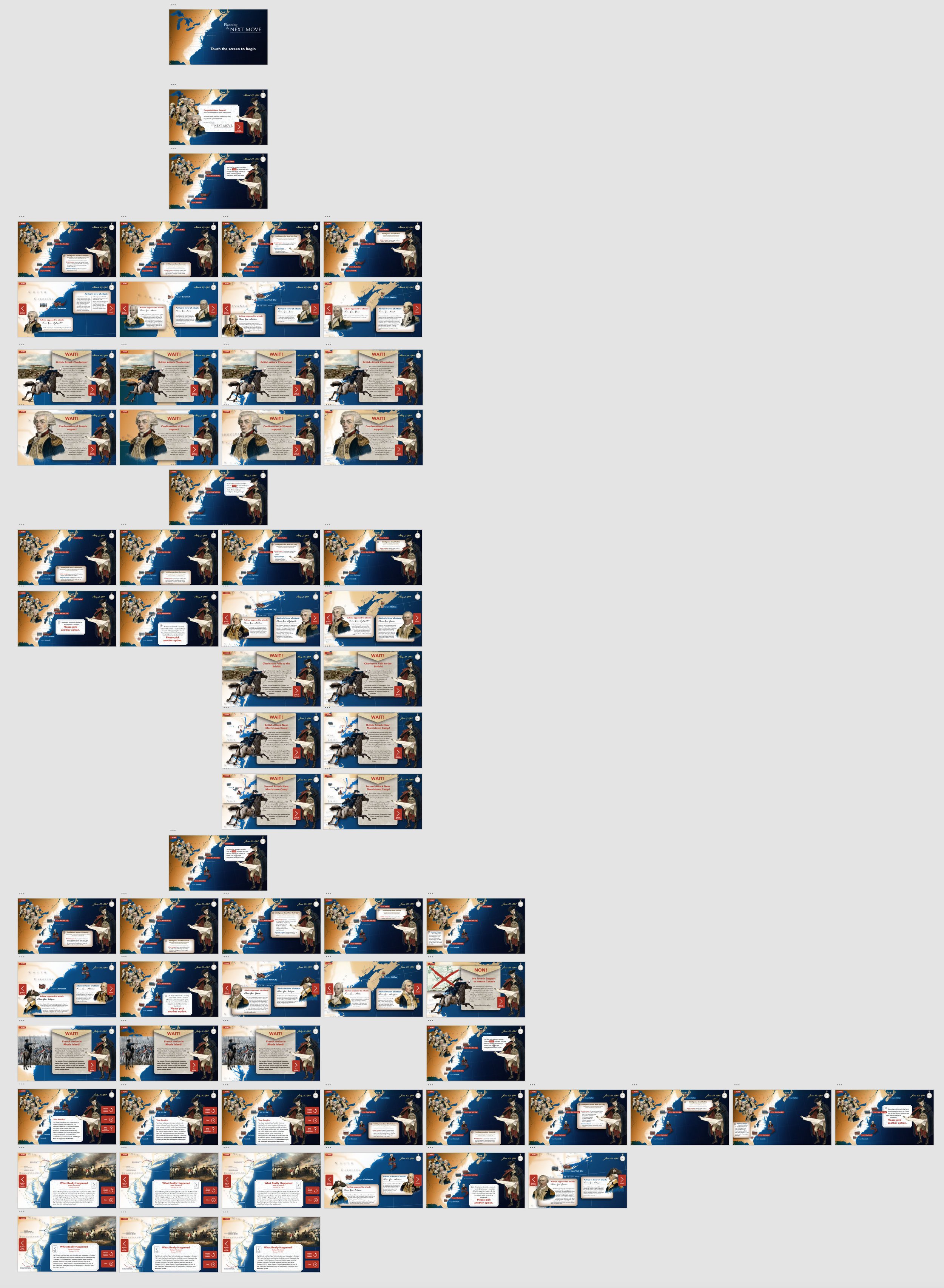
First Draft Logic Flow
This project went through multiple iterations of logic flows as we worked to refine the game play: when users would be interrupted by "events outside their control" (an important element the client wanted, as Washington was continually battling shortages, and reacting to events, rather than moving to attack, as he would have preferred).
Three Events; Reading Generals' Advice
In this initial logic flow, I have not spelled out the content, but I have outlined the three interruptions that happen to Washington before he can go on the attack. I have also showcased different opportunities for users to hear the real advice of Washington's generals. Although much changed over the course of the design process, those elements — the interruptions and the reading of advice — remained in the final product.


Revised Logic Flow
In this logic flow, which was based on several script drafts, and on initial layout prototyping, we went back and revised several elements of the game play.
The Four Targets: Charleston, SC; Savannah or St. Augustine; New York City; Penobscot or Halifax
The script had trouble containing the "four targets" to four actual targets, and so several different cities that Washington's war council considered were jammed together into roughly geographically similar areas.
Reading Pros and Cons from Washington's generals
At this stage we had users click on a target, which would zoom in on the map, and from that screen, allow them to click again on two pieces of advice — one for, and one against attacking that particular target. In the end, we simplified this in an effort to reduce the barriers to reading the advice.
Interruptions — only three?
What counts as an interruption when you're commanding the Continental Army against the British? Our script had difficulty keeping the number of interruptions down to three, so we had to figure out a way to group interruptions together.
Time Pressure
We decided to add the element of a clicking clock in the corner of the screen. There is so much content to read in this interactive, we knew users weren't going to read it all, and we wanted them to stay focused on the pressure of making a decision. Even though events moved at a seemingly glacial pace by today's standards, Washington always felt the pressure of time in his decision-making.
The screens prototyped
This represents a simplification of the experience from the original logic flow and script.

Transition from attract mode to opening screen
Everything in this interactive was designed as a layered file, so that transitions could be created from multiple elements.

The Planning Screen
On this initial screen, users can see the main targets (now whittled back down to four): Halifax, New York City, Charleston, and Savannah.
Troop Strength:
Users can click on the troop icons next to each target and read about the relative troop strength of the Continental Army and the British Army at that target. We also added the distance Washington's army would have to march to reach that location — a key consideration for an army without much naval strength.
Targets:
The target buttons take users to a zoomed in detail of the map, centering around that target, which is where they can read "pros" and "cons" about attacking that target, as well as make their decision to attack.
Date and Clock:
The date in the upper right hand corner changes periodically as time progresses during the game, and the clock ticks forward continuously to keep the pressure on the user.

Animation of George Washington’s Pocketwatch
George Washington loved pocket watches, and gave them as gifts sometimes. This pocket watch animation, which I created for the corner nav of the "Planning the Next Move" is based on one of Washington's pocket watches, a pocket watch made by Jean-Antoine Lépine, watchmaker to Louis XVI.
Interrupted by news
During the design process, I animated several transitional elements as suggested moves for the developers. These included a date transition (upper righthand corner), the rotation on the message, and the general timing and order of moves. There are sound effects as well (not presented in this .GIF).


Intelligence about Charleston
In this screen, the user has clicked on the troops near Charleston, South Carolina. A popup with the latest reports from March 27, 1780 appears, showing the British troop strength there, and the American (Continental Army) troop strength guarding the city.
It’s not looking good for the Americans!
Deliberations about Charleston
In this screen, the user has clicked on the target of Charleston, South Carolina.
Here, Washington takes advice from various members of his council of war. We show actual words from various generals who were advising Washington at the time, including this piece of advice from General Lafayette, who was more inclined to attack New York City and take it back from the British.


Wait! There's news from Charleston.
The British have already attacked Charleston, and you receive word that a siege is underway.
Your general agree you must send more troops south. And you do. (Washington actually did send more troops south from New Jersey at this point.)
Charleston Falls to the British
In this transition, the user clicks on a target (in this example, it’s Halifax), but events intercede. A dispatch arrives with news that Charleston has fallen to the British.
Back to the planning board.


The interactive installed at Morristown National Historic Site
The interactive is part of a larger exhibition which puts the experience into perspective and context.
Photo by: Jennifer Gruber