A Touchtable of Philanthropy
A Touchtable of Philanthropy
Client: Georgia College & State University in Milledgeville, GA
Agency: Hillmann & Carr Inc.
This 84” multi-touch table gives 6 simultaneous users the opportunity to interact with multiple modules of content including videos, social media feeds, College news, a digital guest book, browsing college yearbooks and sharing content with friends. Two donor book interfaces allow visitors to search and display one of the over 36,000 entries. A networked content management system allows staff to update any of the content. Administrators can update videos, news stories and add donors almost instantly.
The User Journey
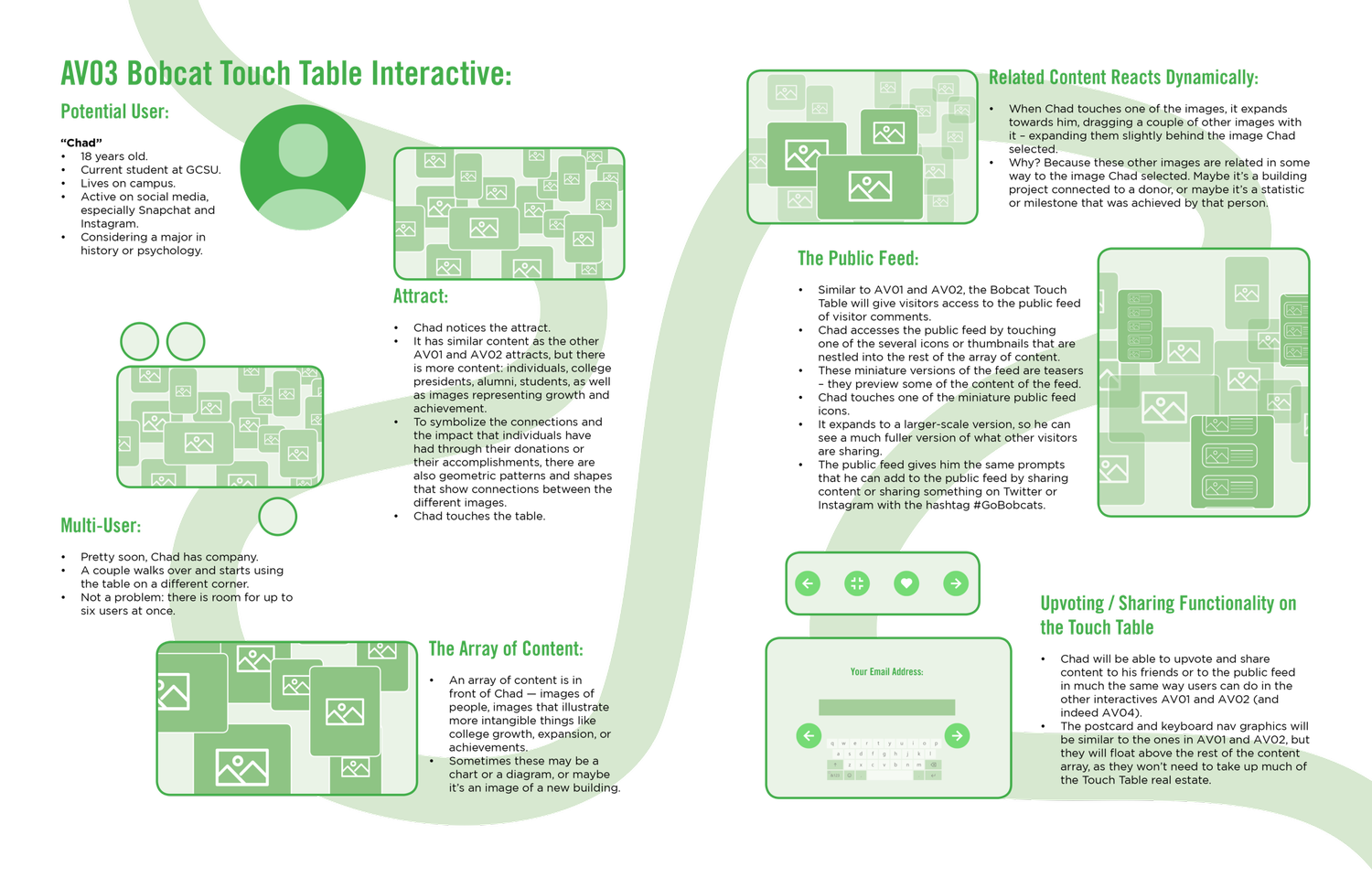
It was important for me that we show the client a fleshed-out user journey map at the beginning of the project. This user journey responded to the exhibit designer’s initial description of the experience, and imagined a user named “Chad,” going on a journey of experiencing this touch table.
We imagined who our user is, some demographic information about him, his social media habits and his academic interests.
Then we walked through the experience with him. He notices the attract, he sees the similarity to other media in the space, but also how it differs. He touches the table. He soon has company, because this is a multi-user table. He sees an array of content. He touches one of the images, and the content reacts dynamically. We imagined a “public feed” that would be based off of user-generated content. And we described an upvoting/sharing functionality for the table.
Initial Logic Flow
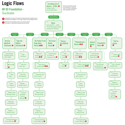
After our first meetings with the client, some of the options in the user journey stayed in the design, and some did not.
This initial logic flow showed our first attempt at organizing the different experiences the client wanted to include in the table in a way that users could understand and access quickly. I also wanted to show which content the client would be able to update through the content management system.
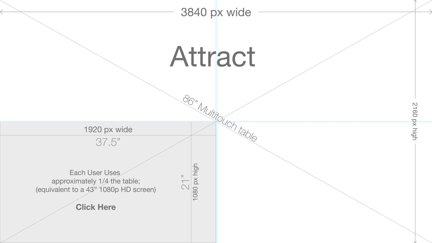
Wireframing
The next step was to do a series of wireframes. The initial thinking was to divide the table into four user stations, although in the end, we created space for up to six users.
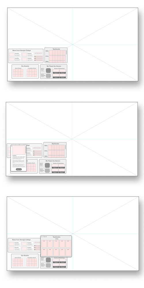
Wireframing may not look like much...
…but that’s partly the point. This portion of the design process is focused on getting the functionality figured out without worrying about the branding or the look and feel.
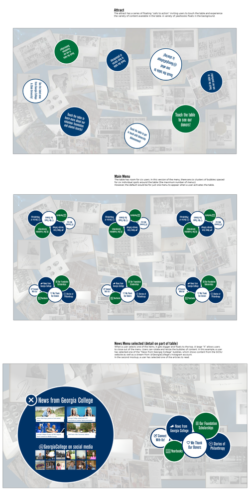
Look and Feel Comes Next
These screens show the attract, the menu, and a detail of a screen with the news button selected.
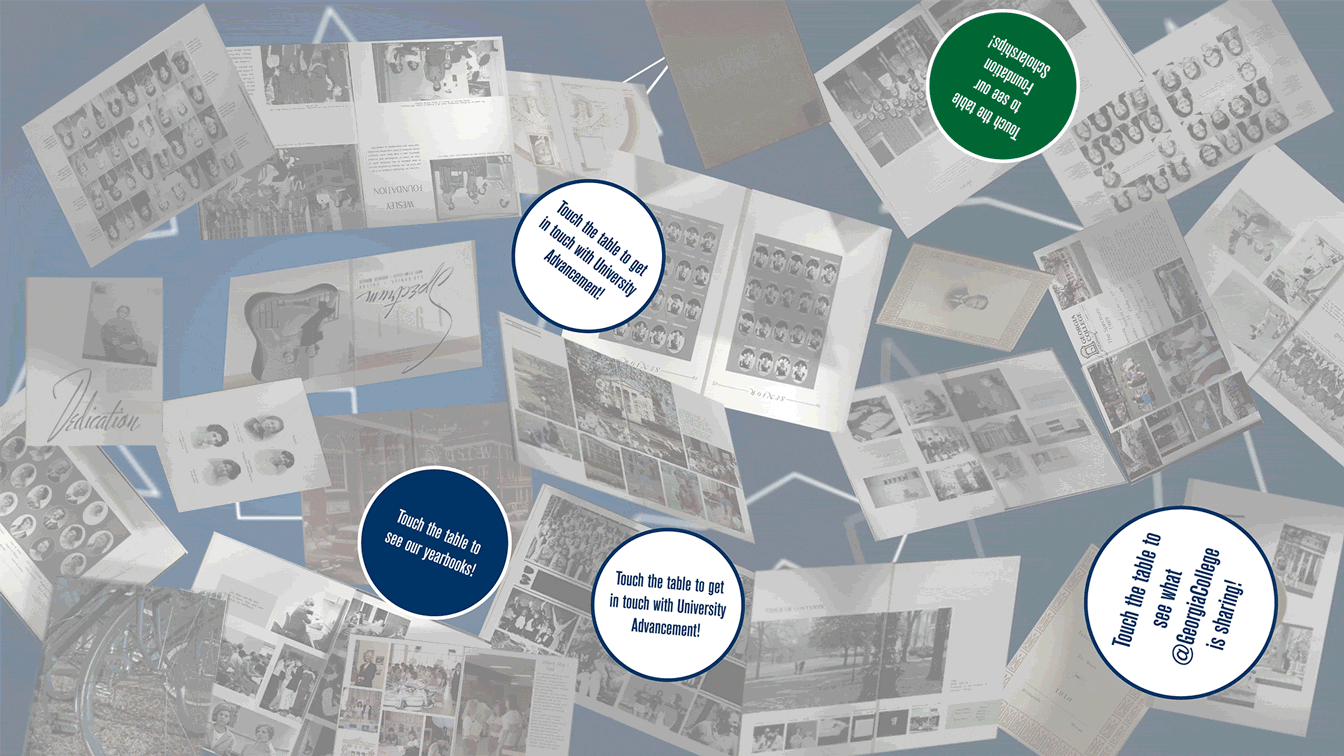
The attract is a series of floating “calls to action” inviting users to touch the table and experience the variety of content in the table. Yearbooks float in the background.
The menu is six clusters of bubbles spaced for six individual spots around the table.
The News Menu - this shows one of the items floated to the top with a large “X” for navigating away from it.
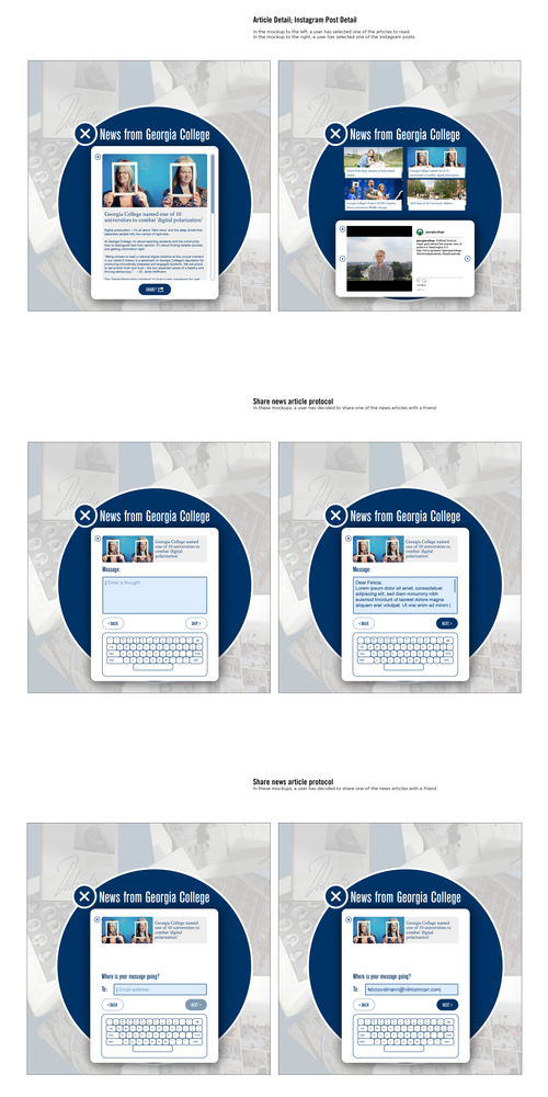
The mockups include text inputs
In these mockups, a user selects an article to read, chooses to share it, and goes through the steps of sharing it with a friend.
Attract Mockup
As usual, my work included animation work. This is a short clip from the table attract, showing some of the calls-to-action moving around the screen.
The Table in Action
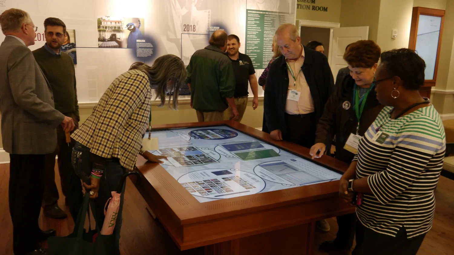
One of the things that we intended was for this table to work well with different audiences who are looking for experiences of varying depth and length. This table supports dwell times that are very brief and very long, since up to six people can use it at once, and because it contains so much content to browse.
In-depth use
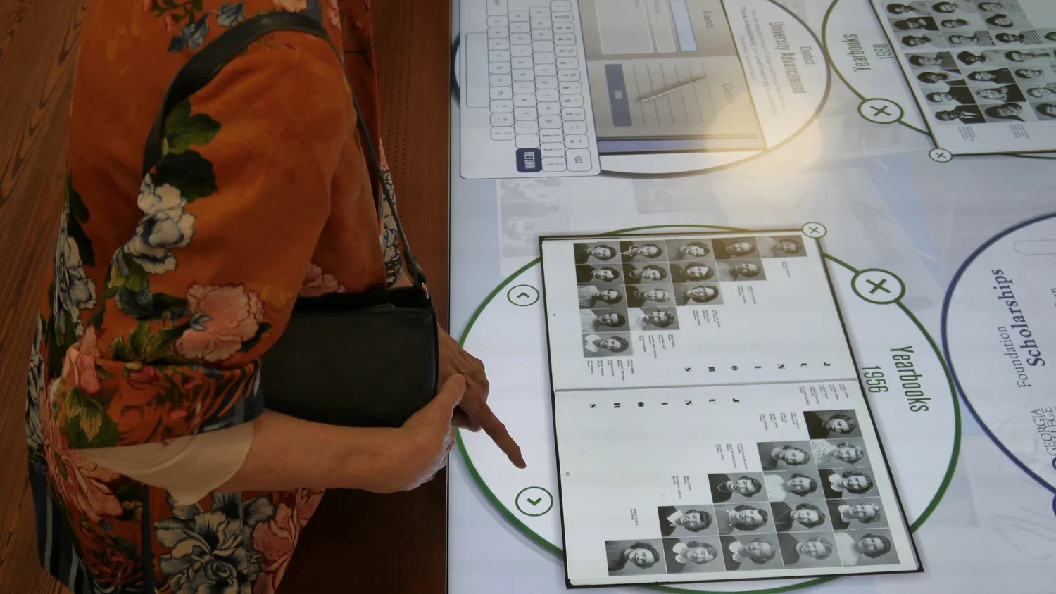
Some visitors spent a long time, browsing through all the pages of specific yearbooks.
Quick use
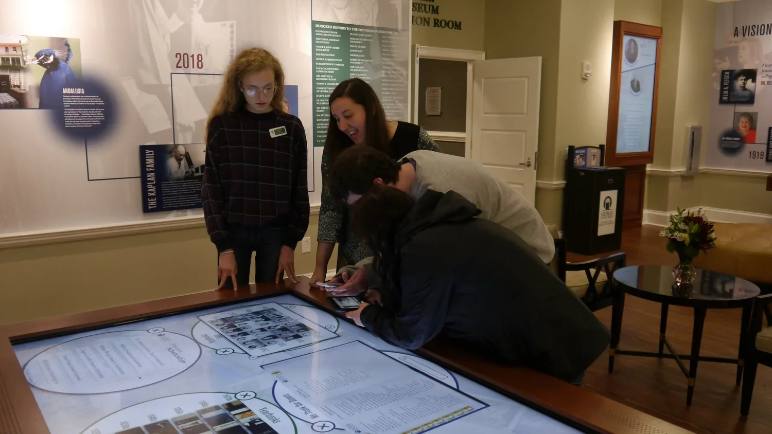
Other users were happy to browse quickly and interact with the table in a multi-screen environment.